Before any hiring manager anywhere dives into your resume or CV, they are going to give it a “first look.” If it doesn’t look like an easy read, it often won’t get read at all.
So when it comes to using a website like JobsinJapan.com, which allows you to upload your resume in the format of your choosing directly to an employer’s database, the readability and aesthetics of your document become a big way you can make yourself stand out.
And even if you luck out and find a hiring manager who is more willing to overlook less-than-ideal formatting, a resume and CV with good white space and easy-to-understand headings will do a better job of showcasing your skills. Hiring managers may not consciously realize it, but taking the time to make your job application materials visually appealing can pay huge dividends.
To get a good idea of the power of blank space in particular, the next time you’re walking around, check out the advertising and other displays you see around you. Once you start looking, you’ll notice that most media uses a healthy amount of negative space to help draw your attention to the important content. You don’t want to clutter up your message with a bunch of distractions.
So how do you put all of this into practice during your job hunt? The following are a few guidelines that should help make your resume more readable, and as a result, more effective overall.
Healthy Margins and Space
There should always be a healthy chasm between the edge of the page and the awesome content of your resume or CV. The standard settings are for 3/4″-1” on all sides, so be sure to set up your document’s layout to reflect that. If you use Microsoft Word or another conventional word processing program, you shouldn’t need to adjust the settings.
Strong Headings and Bullet Points
You want your resume to be extremely easy to pick up and understand in an instant. There should be no question as to where the reader’s eyes should immediately focus, and your headings should direct the reader where to go to quickly retrieve any other relevant information.
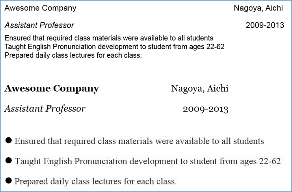
Check out these two examples for a clear illustration of this point:

Notice the difference? By the adding the power of white space and bullet points, this writing can be easily skimmed for the most important information, or looked deeper into for all the details. By spending a little effort arranging the information, you can effectively conveying both the big picture pieces and the sharp details.
Keep it Succinct
Thanks to the internet, the average attention span of humans is getting shorter every day. This means that people trying to get hired have less time than ever to grab the attention of a hiring manager. To give your resume the best shot, you’re going to want it to be the tightest, most streamlined job-getting machine possible.
Keep the following in mind to make sure that happens:
- Unless you’re going for a late-in-career position, keep both your CV and resume to one page.
- Keep your sentences short. Paragraphs should be avoided on your resume and should be very brief in your CV. More than three sentences? You’re going to need a new paragraph.
- Try to keep bullet points to one line. Bullet points should highlight quick snippets of awesomeness about you, not long, drawn out, detailed explanations of your Wednesday morning tasks at your previous job.
A well formatted resume and CV makes all of the content in it just seem better. It helps you appear smarter, more prepared and more qualified than a someone who doesn’t understand the power of white space, formatting and design.
On this site, you have an opportunity to decide exactly how hiring managers see your materials. Don’t waste this chance to highlight yourself by not taking advantage of this. Use this chance to showcase your skills and experience in the most readable way possible.
Happy hunting!


